1) Warm wood tones are perfect for fall decor-- show off your wood table by using a runner instead of a tablecloth.
2) Wrap greenery or a garland of fall leaves or berries around a candle centerpiece.
3) Tuck mini pumpkins, gourds, nuts, acorns, or pomegranates into your fall garland for added interest, color and texture.
4) Keep the centerpiece low so people at the table can converse easily. Use short pillar candles, votives and low, short vases of flowers instead of taller candles and vases.
5) Do use candles-- warm candlelight will make any event feel more festive.
6) Use fall colors in the place settings: for example: brown leather placemats and cloth napkins, terracotta-colored ceramic plates, and green glass water goblets.
7) Include a mini pumpkin nestled in some fall leaves at each place setting. Guests can take the pumpkins home as favors.
Monday, November 16, 2009
Sunday, November 1, 2009
Home Decorating Tips from Model Homes
If you're like me, you like visiting model homes to get home decorating ideas. I recently visited a new development in Livermore, California just to check in and see the 2009-2010 home design trends in action. Here's a list of my observations with ideas you might be able to incorporate into your own home:
- Popular paint colors and color schemes: In models, you will notice that the designers select three or four colors and use them throughout the entire home. This gives a feeling of consistency and flow through the home, and instinctively makes a house feel pulled-together. The first house paired a warm honey wheat color with navy blue and cream. To use this technique successfully, use all the colors in each room, but in varying concentrations. For example, if the living room has honey-colored walls, cream sofas and navy blue drapes and accent pillows, then the home office can have navy blue walls, cream colored shutters and trim, and honey-colored upholstered chairs. Other color schemes to emulate: The second model home had similar honey-colored walls, but the accent colors were rust and dark brown. The third house accented tan walls with pops of red, purple and gold. And the last house used pumpkin, green and cream to enhance the neutral tan walls.
- Wallpaper: The model home designers used dramatic large print wallpaper to tie all the colors in the house together. Used mainly in the bathrooms and laundry rooms, the wallpaper patterns brought lots of interest to the spaces, while serving the important purpose connecting all of the colors in the home's color scheme. For example, the master bath in the first house featured a beautiful wallpaper with a navy blue brocade print with flecks of cream and honey. Wallpaper can be intimidating to some people, but learn from the model homes-- a little wallpaper can make rooms, especially smaller rooms, look very grand and striking.
- Natural Materials: Natural stone or wood on the floor, granite counters, glass tiles in the kitchen and baths, woven wood Roman Shades-- all of these natural materials give a home an upscale, warm, and inviting look. Natural materials will never go out of style. Use natural materials whenever possible.
- Patterned Carpeting: When carpeting was used (mostly in the upstairs living spaces), it featured subtle patterns and textures to keep the look interesting and up to date. Besides being attractive, patterned and textured carpeting helps disguise footprints, dirt, and other evidence of wear.
- Mismatched tables: Designers today think about coordinating, rather than matching, their furniture pieces. For example, instead of matching night stands, use a small chest of drawers on one side of the bed, and a round, fabric-covered table on the other side. The days of the all-matching bedroom suite are over. Coordinated furniture pieces look more interesting and personal, like they have been collected over time. They can also help serve different purposes. For example, if one partner needs more clothes storage, it makes sense for her to have a chest of drawers. If the other partner needs space for books and magazines, give him a table with a shelf below. This creates a space that not only looks beautiful, but also meets a variety of needs.
Visiting model homes is a great way to get decorating ideas for your own home.
Thursday, August 20, 2009
What the Client Wants vs. What the Designer Wants
Have any of you been keeping up with Design Star on HGTV? Last week when Antonio said he'd rather go home than paint another wall beige, that really struck a cord with me. What a conflict for decorators and designers everywhere! The client asked for a neutral room, but the designer gave her a blue room. Luckily they client loved the finished room, but the Design Star contestants really took a risk. Were they right to do what they did? Or should they have given the client what she asked for?
If a client says she "loves neutrals" is it because she really truly is drawn to tans and brown, or because she is playing it safe and is afraid of trying something more colorful? While we decorators and designers have to take our clients' needs and wants under consideration, we are also there to provide guidance, assurance and confidence that the client will love the finished result. It is our job to get people out of their comfort zone a bit and give them something they wouldn't have thought of on their own. Isn't that why they hire us?
If a client says she "loves neutrals" is it because she really truly is drawn to tans and brown, or because she is playing it safe and is afraid of trying something more colorful? While we decorators and designers have to take our clients' needs and wants under consideration, we are also there to provide guidance, assurance and confidence that the client will love the finished result. It is our job to get people out of their comfort zone a bit and give them something they wouldn't have thought of on their own. Isn't that why they hire us?
Monday, June 29, 2009
Trials and Tribulations of Buying a Sofa
Well, we finally bought a new sofa. We have owned our last sofa for about 15 years, and I know it needed replacing. It just wasn't comfortable anymore, although, in black leather, it still looked pretty decent.
I've been sofa shopping for at least 2 or 3 years now-- my husband estimates that we sat in at least 30-40 sofas during that time. What took me so long to finally decide? It was really tough finding a sofa that was comfortable enough for our family, yet still attractive enough for my design sensibilities. The perfect sofa for me includes the following characteristics:
1- It is good looking, with clean lines and a tailored, contemporary look
2- It is comfortable for TV watching and working on my laptop
3- It is high enough in the back to give good neck support
4- It is not so deep that my feet do not touch the floor when sitting (I am just under 5 feet tall)
5- It is long wearing and durable
6- It doesn't cost a fortune
There are probably many of you out there who can relate to this list. The good news is that I finally found the sofa and it was in stock, available for delivery in just three days. I found it at La-Z-Boy. Comfort was a higher priority than having my idea contemporary-style couch, although the sofa is good looking enough to please me. It has a streamlined look, and does not have the large back cushions like many other sofas. Since my husband and I work quite a bit on our laptops, we opted to buy a reclining sofa. Each end reclines, so both of us can have our feet up, and our laps are in perfect position for the laptops and for TV
The whole family is enjoying the comfortable new couch. Now I can devote my efforts to finding the perfect fireplace tile!
Tuesday, May 26, 2009
Three Do's and Don'ts when Choosing Colors for Your Home
I spend a great deal of time helping my clients choose just the right color for their home. Many of them have lived with white walls for years and are ready for a change; others have tried colors but for whatever reason feel unhappy with their choice. Here are three do's and don'ts to help you choose the perfect color for your home.
1. DON'T get fixated on the idea that dark paint colors make a room look smaller. Some rooms are small-- a dark color will make the room feel cozy and dramatic. A friend of mine painted her dining room a dark chocolate brown, and it is stunning! And I selected a dark burgundy red for a client's powder room. The look is rich and elegant.
DO use lighter colors in the upholstery, furnishings and trim to contrast and balance the dark paint colors. For example, in a chocolate brown dining room, use antique white crown molding and baseboards, and a cream-colored tablecloth. Use artwork with dark frames and white mats.
2. DON'T forget about the ceiling. If you paint the walls a darker color and leave the ceiling white, your eye will draw upward to that stark white ceiling.
DO paint the ceilings! If your walls are red, for example, select a neutral tan color for the ceiling to soften the contrast between the walls and ceiling. In a small room, try painting the ceiling either the same color as the walls or a shade or two lighter than the walls. In my own home office, my walls are blue, and the ceiling is one shade lighter.
3. DON'T judge the room or the color until it is all done and put back together. Even I got scared when my husband and I painted our bedroom a dark brick red color. After the first wall was painted, I wanted to give up and start over. However, we kept on painting. After I put the furnishings back in, and made the bed with the colorful new bedspread (that, of course, contained quite a bit of the brick color), I loved the room. It looked cozy and warm; very unique.
DO trust yourself-- if you've had white walls for years, it will take you a little while to get used to the color. But give yourself that time. I promise that once you've tried wall colors, you'll never go back to plain white.
Monday, April 13, 2009
A Case for Artificial Flowers
For the second time in a few months, I've heard the designers on HGTV counsel against the use of artificial flowers and greenery. Real is better, they say. And I have to agree, but with one big exception: if you are like me and have a hard time keeping plants alive, let alone looking good, then you should consider artificial plants. Believe me, a dying, gangly philodendron, or a pot with a stick and a couple of leaves do nothing for your decor!
I know why designers disapprove of artificial flowers and plants. It is because people commit two big faux pas when they own them:
1- People let artificial plants get dusty. When plants are dusty, they make your house feel dirty and unkempt. Make sure you buy high quality artificial flowers and greenery, and make sure you keep them dusted and looking fresh.
2- People keep artificial floral arrangements long past their prime. If you have arrangements from the 80's please let those go! Chances are they are making your house look dated. Make sure your artificial flowers are in colors that actually appear in nature, and don't look like they've been around for 30 years.
If you are really attached to your artificial arrangements, give them new life by pulling out all the flowers, tossing out the really old-looking outdated stems, and creating a new arrangement by mixing some of the old flowers with new stems. Use a new container for an updated look.
Thursday, April 9, 2009
Three Unique Baths for Three Unique Clients
This year so far, I've been lucky enough to help several clients with their bathroom remodeling projects. Three different clients, three very different bathrooms. This is the best part of my job-- every client is unique, and I get to design spaces that really fit their taste and lifestyle. Maybe you can get some ideas for your own remodel.
Bathroom #1: Vintage Splendor
Picture this: Lots of white-on-white, very clean and pristine. White subway tile in the shower, accented by an embossed white border tile. White hexagon tiles on the floor. Gorgeous clawfoot tub, front and center, the focal point of this beautiful bathroom as you open the French doors. Overhead is a beautiful vintage chandelier, centered over the tub. White beadboard paneling, white porcelain sinks with shiny chrome fixtures. For color, we chose a lovely lavender paint for the walls, very calming, a nice contrast with all the white. The client, a fan of all things old-fashioned, is thrilled with the results.
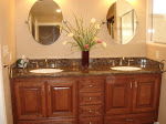
Bathroom #2:
This bathroom will be a stunner when it is complete: chocolate-brown Emperadora Dark marble tile on the floor, and also as an accent in the shower. Fixtures are bronze finish, shower tiles are creamy-colored marble. The vanity is amazing-- carved wood with ornate detailing, creamy white with a chocolate glaze distressed finish. The shower is embellished with a floor-to-ceiling custom shower curtain in chocolate-brown faux silk with an embroidered floral motif. My client can't wait to show off this elegant bath.
Bathroom #3: Casual Country
With mossy green walls and crisp white trim, this bath is colorful and casual. The shower curtain adds pattern and color with stripes of blue, brown and terracotta. The shower tiles are rustic green, and the floor is a wood-look water-resistant material. The overall look is warm, cozy and casual.
Bathroom #1: Vintage Splendor
Picture this: Lots of white-on-white, very clean and pristine. White subway tile in the shower, accented by an embossed white border tile. White hexagon tiles on the floor. Gorgeous clawfoot tub, front and center, the focal point of this beautiful bathroom as you open the French doors. Overhead is a beautiful vintage chandelier, centered over the tub. White beadboard paneling, white porcelain sinks with shiny chrome fixtures. For color, we chose a lovely lavender paint for the walls, very calming, a nice contrast with all the white. The client, a fan of all things old-fashioned, is thrilled with the results.
Bathroom #2:
This bathroom will be a stunner when it is complete: chocolate-brown Emperadora Dark marble tile on the floor, and also as an accent in the shower. Fixtures are bronze finish, shower tiles are creamy-colored marble. The vanity is amazing-- carved wood with ornate detailing, creamy white with a chocolate glaze distressed finish. The shower is embellished with a floor-to-ceiling custom shower curtain in chocolate-brown faux silk with an embroidered floral motif. My client can't wait to show off this elegant bath.
Bathroom #3: Casual Country
With mossy green walls and crisp white trim, this bath is colorful and casual. The shower curtain adds pattern and color with stripes of blue, brown and terracotta. The shower tiles are rustic green, and the floor is a wood-look water-resistant material. The overall look is warm, cozy and casual.
Subscribe to:
Posts (Atom)